Prompts
How to write AI prompts that build better websites
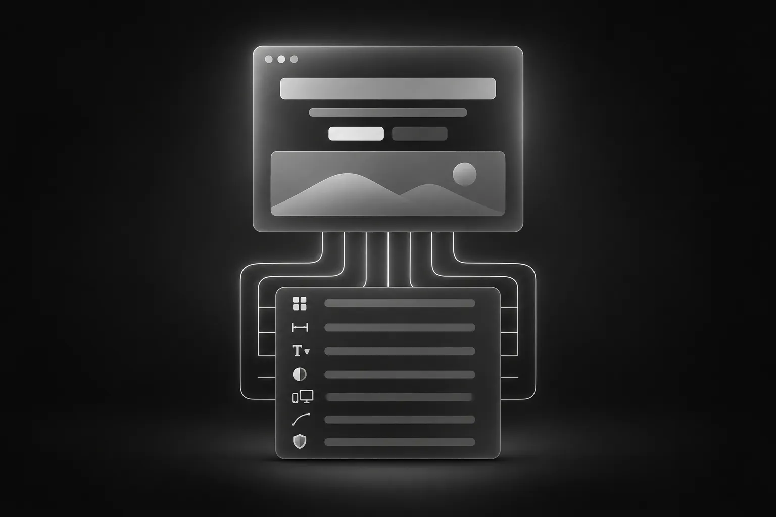
If you have asked an AI to “build a modern landing page” and received something that looks like every other landing page, the problem is rarely the AI. It is the prompt. A model fills every gap in your request with the most average choice available, and for a website, the average choice is a generic page.
The fix is not to write more. It is to write the right details. This guide breaks down what a strong website prompt contains, with examples you can reuse in Claude, ChatGPT, Codex, Cursor or Lovable.
Why vague prompts fail
Take this request:
Create a hero section for my SaaS with a headline, a subtitle and two buttons. Make it modern.It leaves out the layout, the sizes, the colors, the spacing, the mobile behavior and the motion. The AI will pick all of them for you, and it will pick the same ones for everyone. Two people can send that exact request and get nearly identical pages.
Now compare it with a request that names the details:
Create a hero section on a near-black background (#0c0c0c). Center everything. Headline: 4.5rem, weight 600, tight letter-spacing, white, with the last two words in gray (#707070). Below it, a one-sentence description in 1.125rem gray (#bbb), max width 30rem. Under that, two buttons with 0.75rem between them: a white primary button and a dark gray secondary button, both 0.875rem, weight 500, radius 0.5rem. Below 768px, reduce the headline to 2.25rem and stack the buttons.The second prompt is longer, but it is not padded. Every sentence removes a decision from the AI. That is the whole idea.
The seven parts of a strong prompt
You do not need all seven every time, but the more of them you cover, the closer the result gets.
1. The purpose and context
One or two sentences about what the section is and where it goes. “A pricing section for a project management app, placed after the features block.” This stops the AI from inventing content that does not fit.
2. The layout
Describe the structure in order: what is on the left, what is on the right, how many columns, what is centered. “Three cards in a row on desktop, one per row on mobile” is better than “a grid of cards.”
3. Typography and color
Give sizes in rem, weights and exact colors. If your project already has fonts, say so: “Use the project’s existing font, keep these weights.” Sizes in rem also scale correctly when users change their browser’s default text size.
4. Spacing
Padding and gaps are what make a page look designed. Give them as numbers: “2rem horizontal padding on desktop, 1.25rem on mobile; 1rem between cards.” If you skip this, spacing is where the generic look returns.
5. Responsive behavior
Name the breakpoints and what changes at each. A page that looks right at one width and broken at another is the most common complaint about AI-built sites. State the rules: “Below 1024px, two columns. Below 768px, one column.”
6. Motion and interaction
Describe the animation in words, with timing and easing if it matters: “Cards fade in and rise 1rem as they enter the viewport, 0.6 seconds, ease-out, staggered by 0.1 seconds.” For interactions, say what triggers them: hover, click, scroll.
7. Constraints and output
Tell the AI what not to do and what you want back:
- “Keep every link as a placeholder (#).”
- “Do not add libraries.”
- “Do not change other sections.”
- “Return a single HTML file” or “Add it as a new component.”
Constraints prevent the extra “improvements” that break things you did not ask about.
Use exact assets
If the design uses images, include their direct URLs and say how they should be displayed: “Use this image URL, cover the card, centered.” When an AI has to choose its own images, you cannot reproduce the result. Pasting the exact URL makes the output repeatable.
Prompt for one section at a time
Asking for a full page in one message is the second-biggest cause of generic results. The AI spreads its attention thin and every section ends up average. Build in order:
- A short brief about the site.
- One section per prompt.
- A check in the browser after each.
- A short follow-up to fix what is off.
This is also why component prompts exist. A Weblisy component prompt packages the seven parts above for one section: layout, type sizes, spacing, breakpoints, motion and exact image URLs. You paste it, and the AI has no decisions left to guess. If you want to see what a complete prompt looks like, the free component prompts are a good place to start.
Templates or prompts: which should you use?
They solve different problems.
A template gives you a complete site. Use it when you want something finished quickly and your job is to replace the content. It works best with tools that open a project folder, such as Claude Code, Codex or Cursor. Browse the templates.
A prompt gives you one section. Use it when you are designing a page piece by piece, adding to an existing project, or working in a tool that manages its own project, such as Lovable.
Many projects combine them: start from a template, then add the sections it lacks with prompts.
A reusable wrapper
Whatever prompt you paste, wrap it with context. This one works in most tools:
Add the section described below to the page I specify. Match the fonts and colors already used in this project, keep every link as a placeholder (#), and do not change any other section.

[Paste the prompt here]
For a chat tool, replace the first line with “Return a single complete HTML file with the CSS in a style block and any JavaScript in a script block.”
How to fix a result that is not right
Resist the urge to rewrite the whole prompt. Describe the difference:
- “The cards need more space between them on mobile: 0.75rem.”
- “The heading is too heavy. Use weight 500.”
- “The animation is too fast. Make it 0.8 seconds.”
Each fix should name the element, the problem and the value you want. Compare with the live preview and be as precise as the prompt was.
Common mistakes
- Style words without values. “Modern,” “clean” and “premium” mean different things to different models. Numbers and colors mean the same thing to all of them.
- Everything at once. More sections per message means less accuracy per section.
- No mobile rules. If you do not describe small screens, the AI invents them.
- Skipping the check. The AI can say the section is done when it is not. Open the page.
- Expecting an exact copy every time. Results can vary between tools and models, and a perfect match is not guaranteed. Strong prompts get close; follow-ups close the gap.
Which tool to use?
Good prompts work in all of them. If you are not sure which tool suits you, read our comparison of the best AI tools for building websites, or open the pages for Claude, ChatGPT and Codex, Cursor, Lovable and Antigravity to see the setup for each.
Subscribers can also connect Weblisy through MCP, so the AI reads the full prompt and code of a component without copy and paste. See the pricing page for plans.